
CallRail INTEGRATIONs
Role
UX Designer
Keywords
B2B, SaaS, Desktop app, Product in the Market, Startup, Agile
Duration
1 Months, 2019
Method
Usability Test, Product Feature Mapping, Brainstorming, Hi-fi Prototyping
Background
CallRail is a web-based, desktop-based SaaS app that helps businesses grow by maximizing their marketing impact with Call tracking, form tracking, chat tracking, recording, and analytics. It helps track metrics for PPC, SEO, and offline ad campaigns.
CallRail integrates with multiple 3rd party apps. The ability to do so is very important for acquiring new business and retaining existing business. Currently, our integrations page is difficult to locate, and hard to use resulting in a high number of support calls and fails connections.
Mission
My job as the lead UX designer was to improve the integrations page to make it more findable, intuitive, and consistent. If successful, CallRail will see a decrease in support calls, a higher number of connections, and an increase in new business.
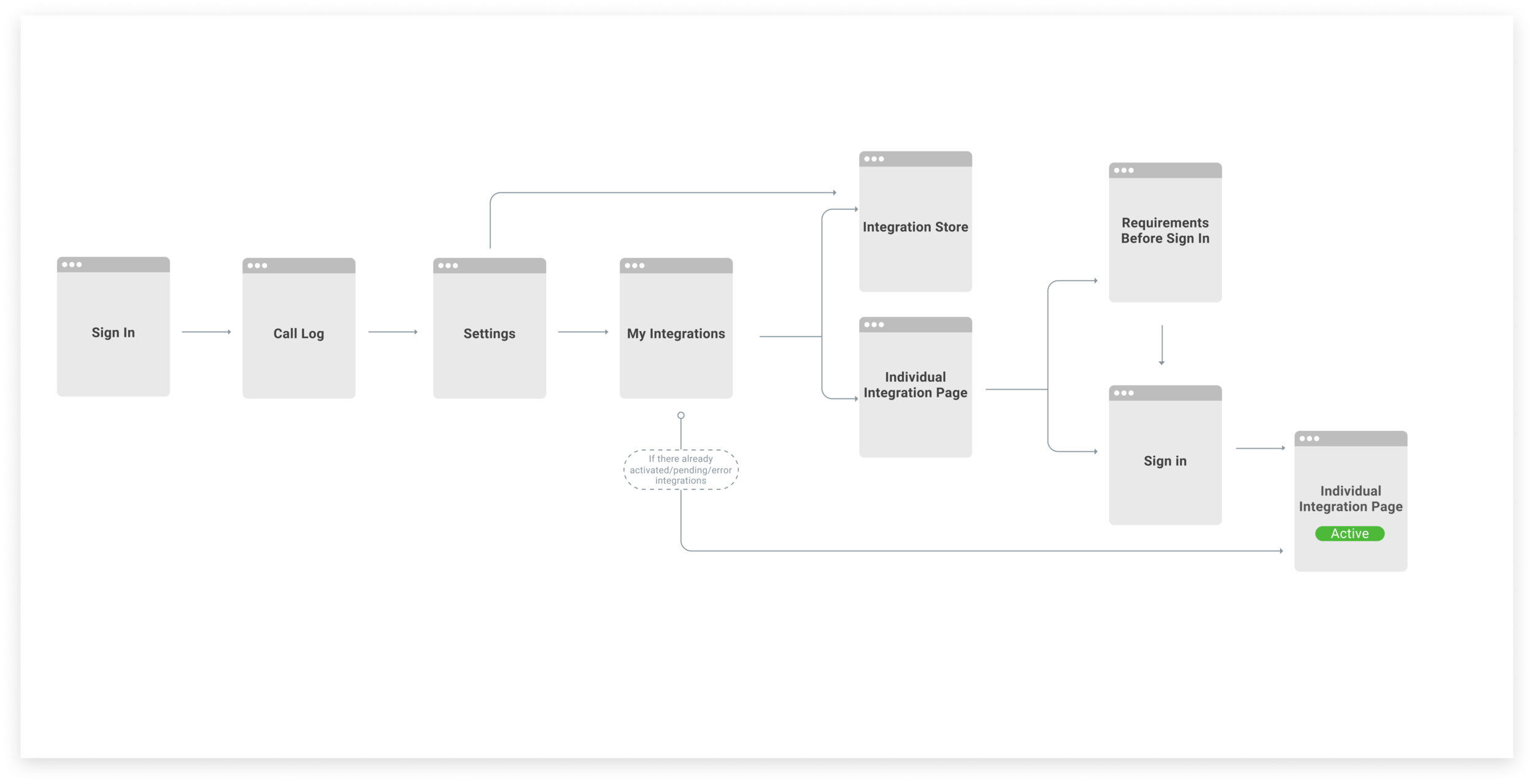
Defining The Scope
I began by creating a task map to understand the most efficient path for users to activate a new integration. The site map below show’s the users happy path”.
User Research
Usability test goals
We want to observe the users login, find the integration page, authorize a Salesforce integration, confirm that it is successfully connected, add a trigger, and identify all the integrations that are in pending state.
testing senarios.
Imagine you are a marketer and you want to connect Google Ads to CallRail. How would you do that?
Now image you want to send only first time callers as a conversions to Google Ads. How would you do that?
Now image you want to all you “Active” integrations. How would you do that?
Results
Users have difficulty understanding the system at first glance, thus rely heavily on trial-and-error to complete tasks.
User could not find integration page
Click around for a bit, then click under “Manage Account”
Decided to click on “Help” icon on the bottom of the screen and went to “Help Center”
Found integration page after a quick search from “Help Center”
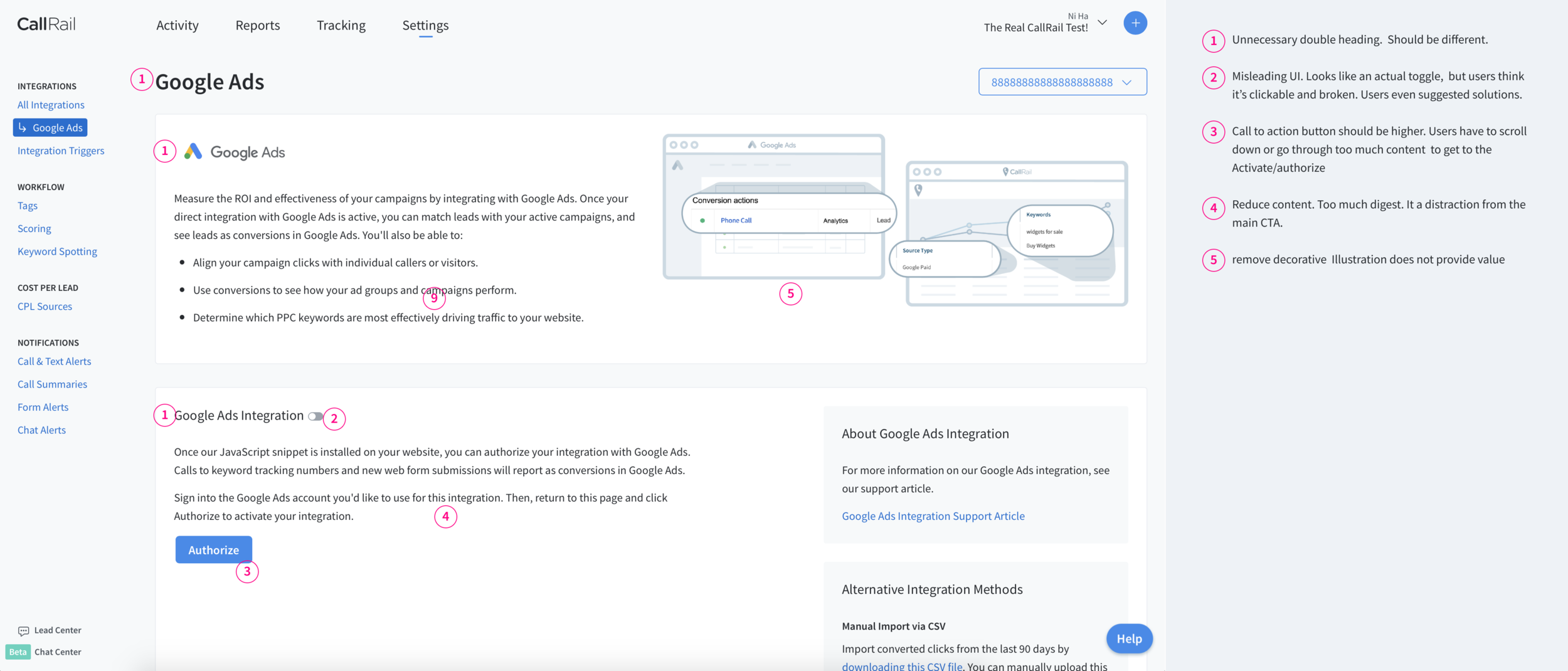
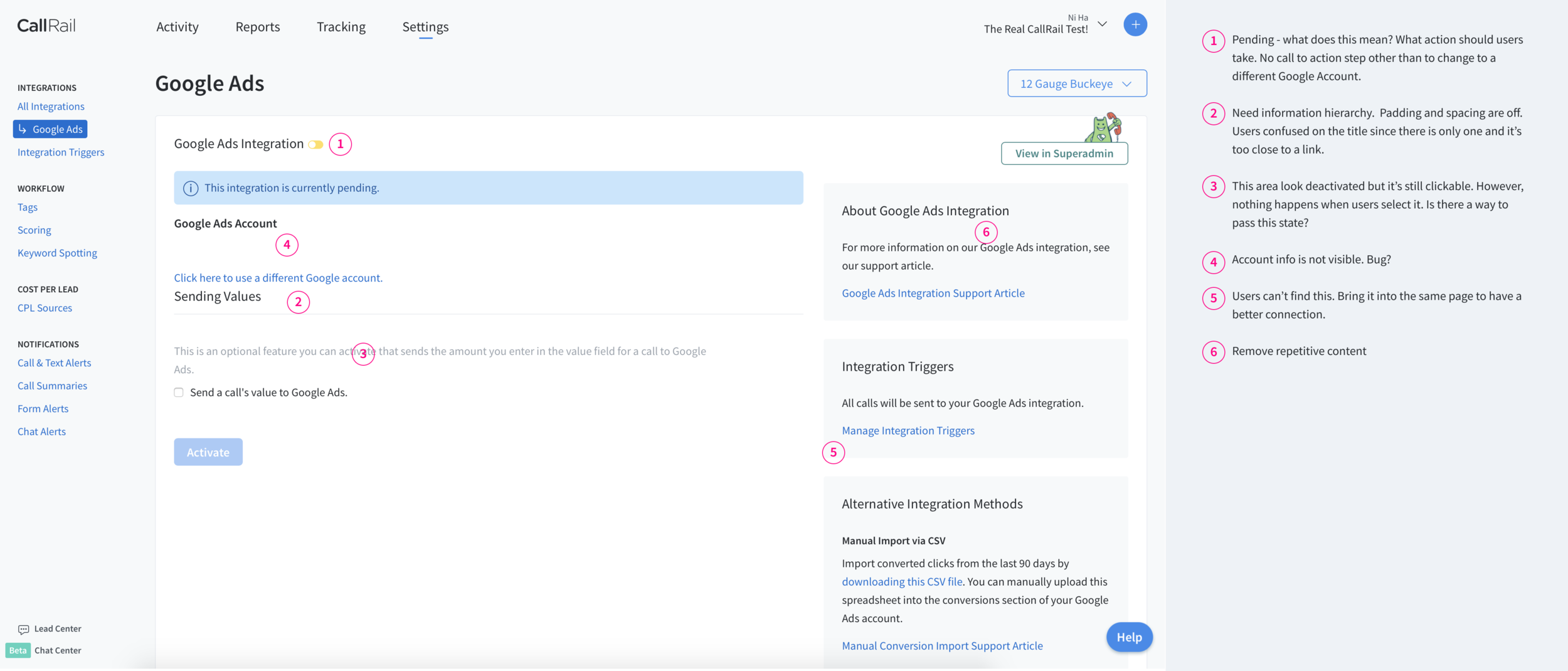
We found bug/bad ux on the Google Ads page.
User click “Authorize” and entered username and password successfully
Integration was still inactive even with the success alert message
User had to click update again to truly “Activate” integration
Integration state ui toggle is inactive but CTA button is saying “Update”
User was confused by the toggle icon next to title of card
Users thought it was clickable then assume it is broken
Want to toggle to turn on the integration like other app
Do not know what the yellow toggle mean
User is not confident if he actually turn on the integration.
Doesn’t not see is actual “active” message on the page. Wants a more prominent indication.
Think the toggle is confusing and not a strong indication of integration state
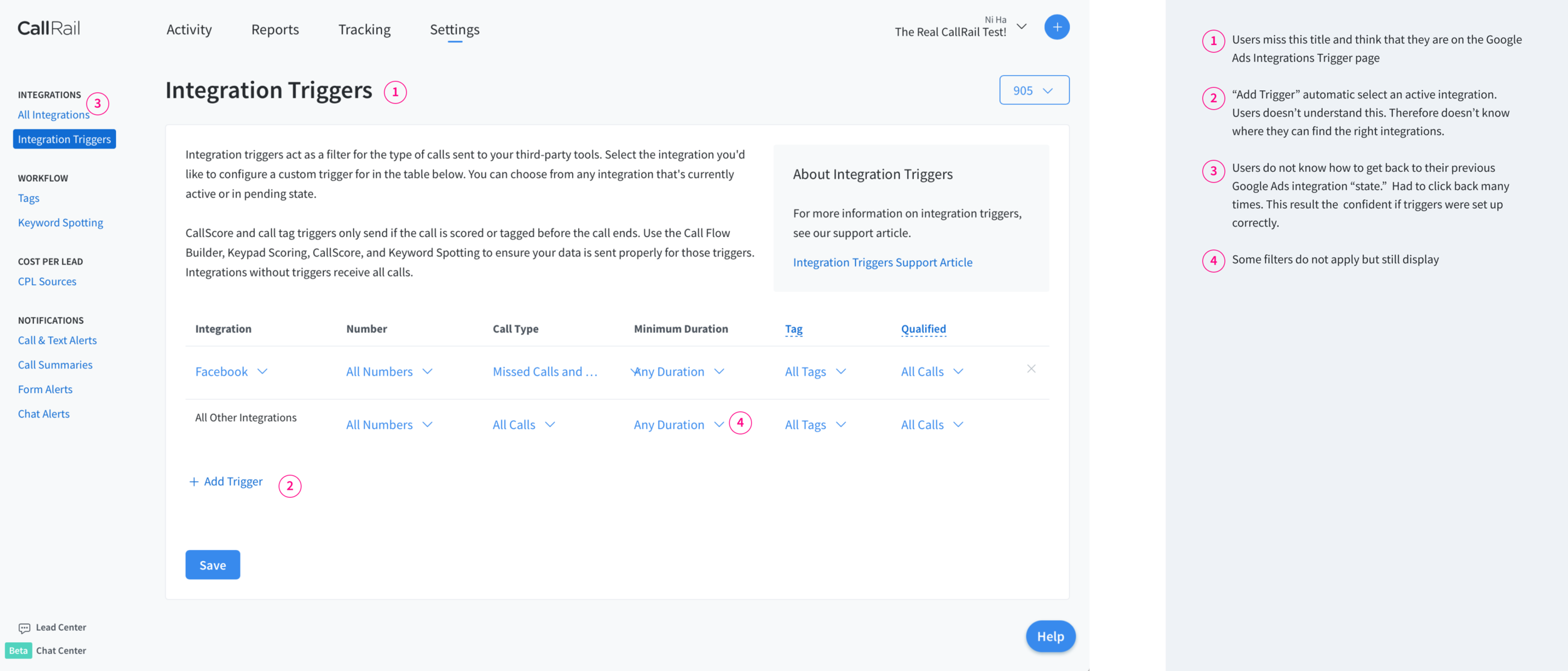
User fail to turn on triggers for Google Ads
User found “Manage Integration Filters” link quickly.
Thought he was still in a subpage for trigger setting specifically for Google ad
Did not read any title or any other content
Added a trigger so another integration
User assumed that he successfully turn on trigger
User wants to go back to the “main” Google Ads page but didn’t know how. He click the back button several times. User lost confident if his trigger actually got saved because he thinks it “undo” what he did by clicking the back button.
User used the browser search tool find which integrations that will work for Form Tracking
Searched form and looked for highlighted keywords
User doesn’t know what yellow corner UI means
Had to click into the app and search. User figured it out after he hover over UI toggle.
My details analysis can be found here: Integration Usability Test 1 General Takeaways
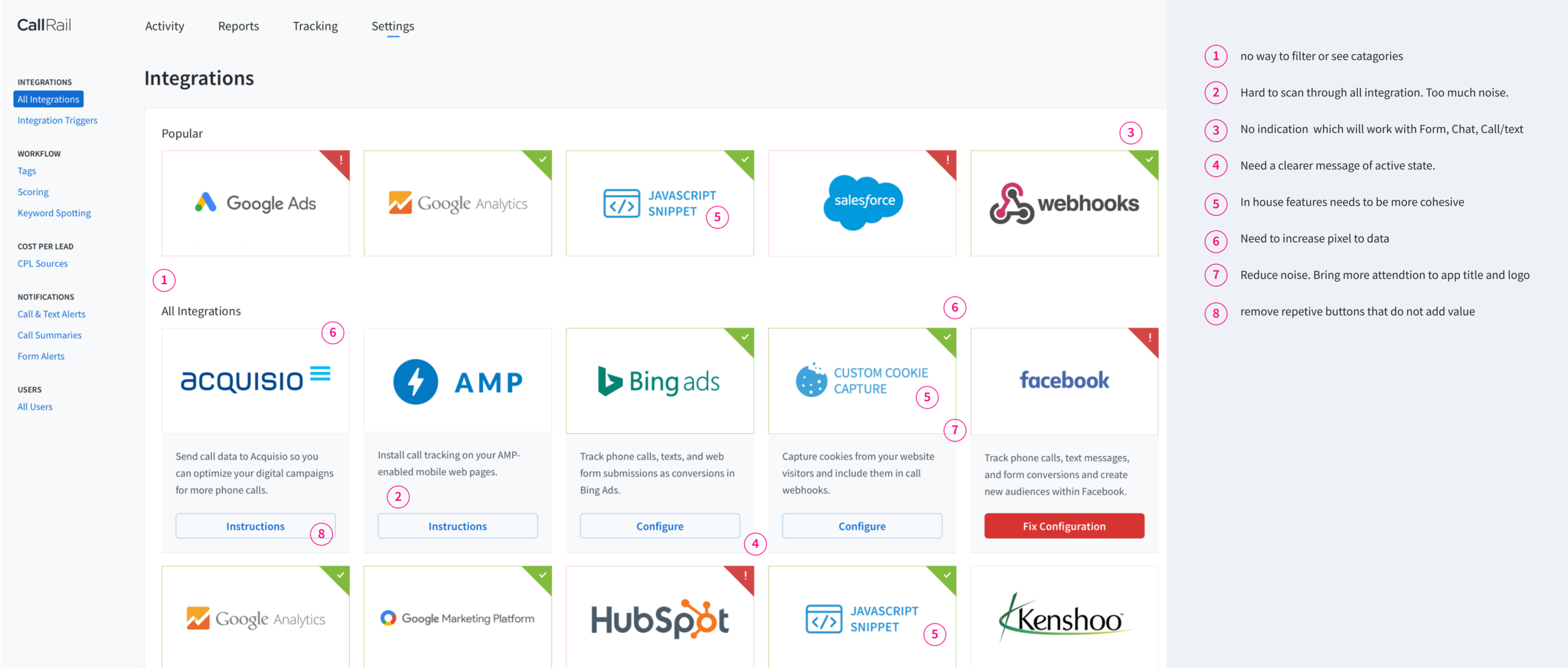
Audit of current integrations feature
Finding Solutions
STEP 1
The first step after understanding the problem was to sketch multiple different possible solutions to the problem. I do this first as a creative exercise before I develop bias form conducting a competitive analysis.


STEP 2
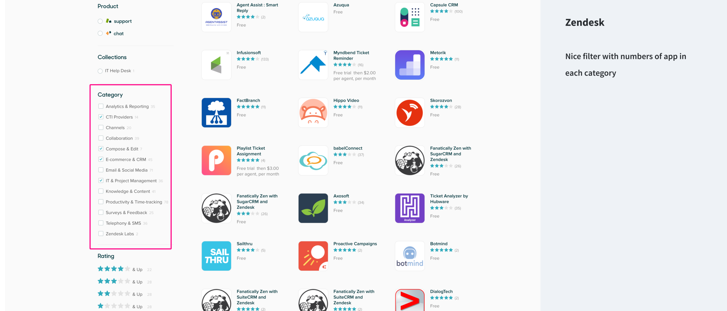
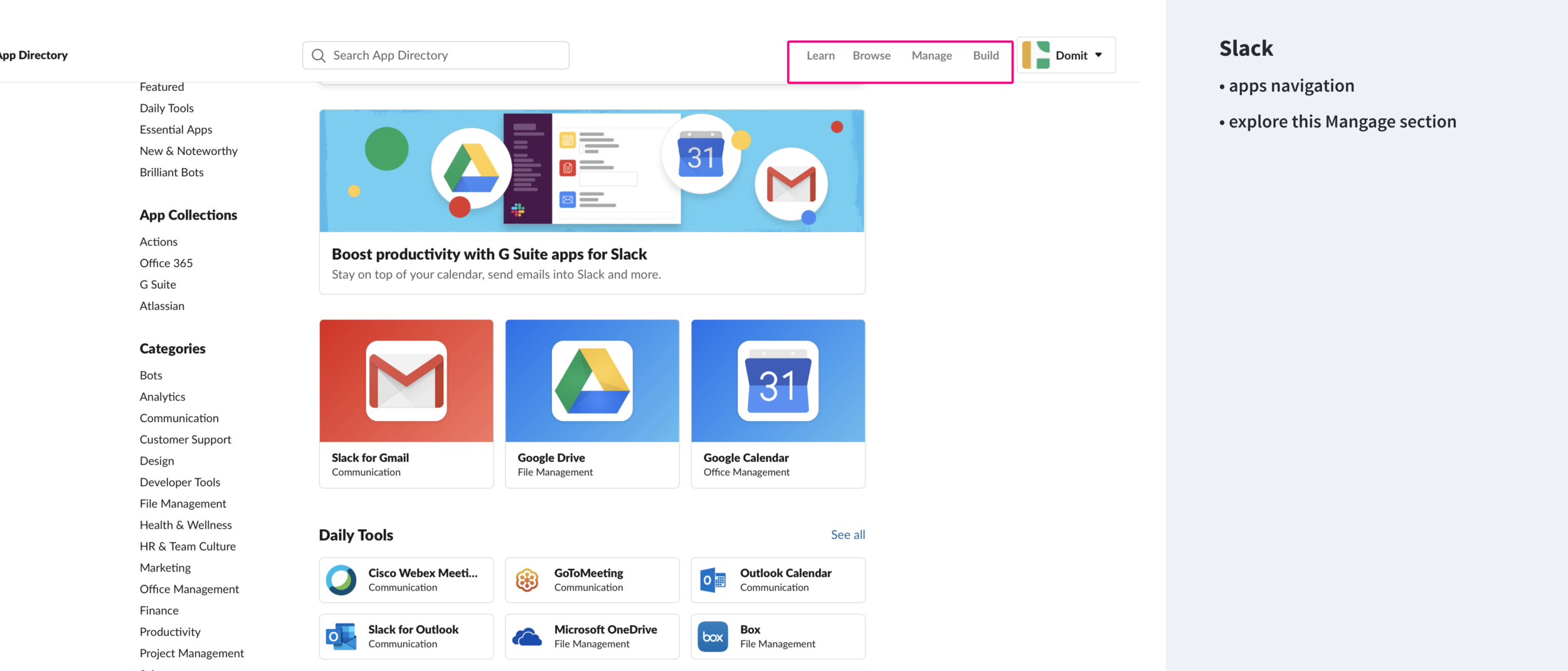
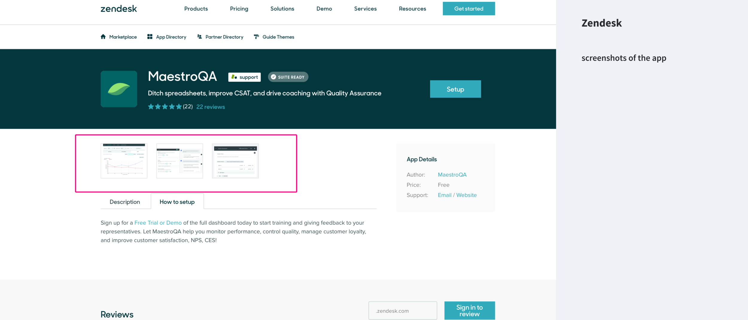
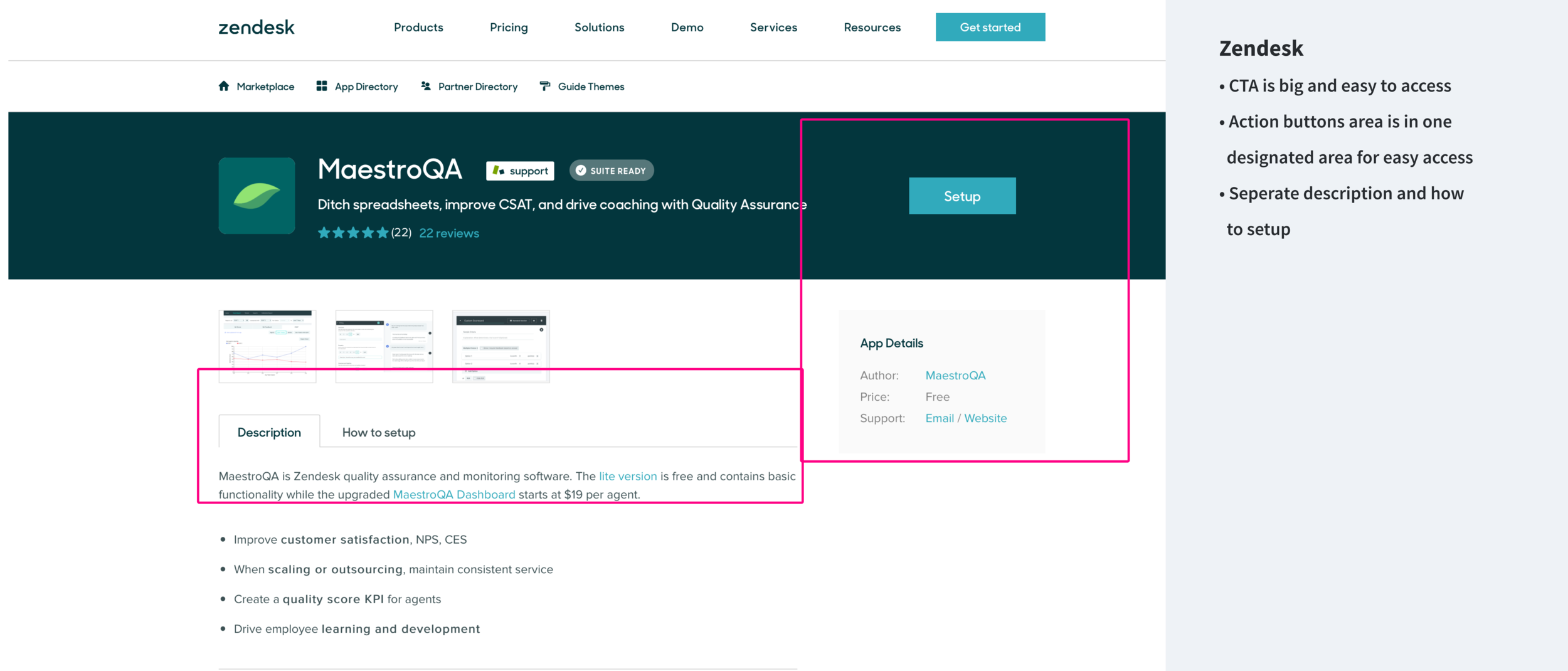
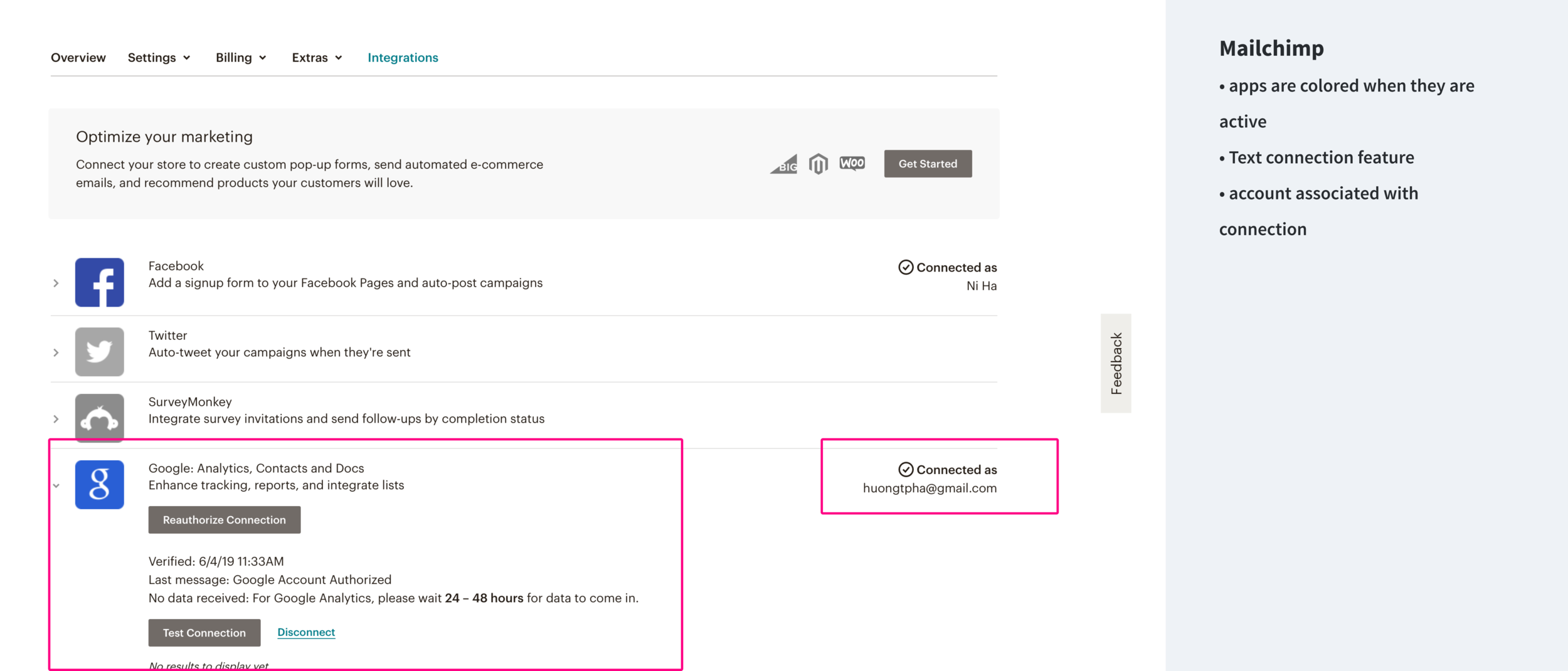
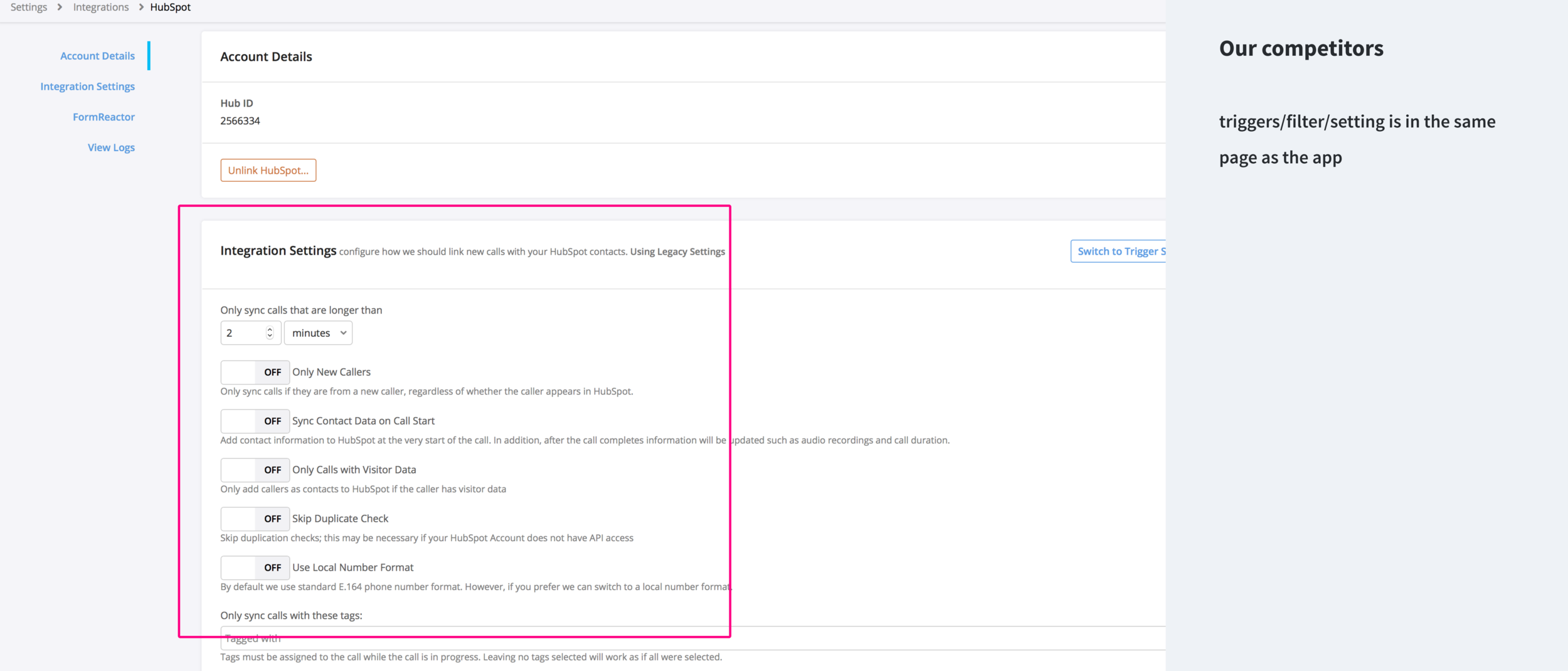
Study the UI design of leading competitors and collect inspirations
Shopify, Zendesk, Mailchimp, Slack, Call Tracking Metrics, and more...
I specifically wanted to understand how our competitors approach up-sell, app info, gallery, active state, pricing, and set up process.

STEP 3
After the above research, I sat down with my team to brain storm all possible improvements to the current screen. We wrote ideas on sticky notes, categorized, and consolidated them. We then further categorized our ideas into quick wins (sort term) and a larger redesign effort (long term).
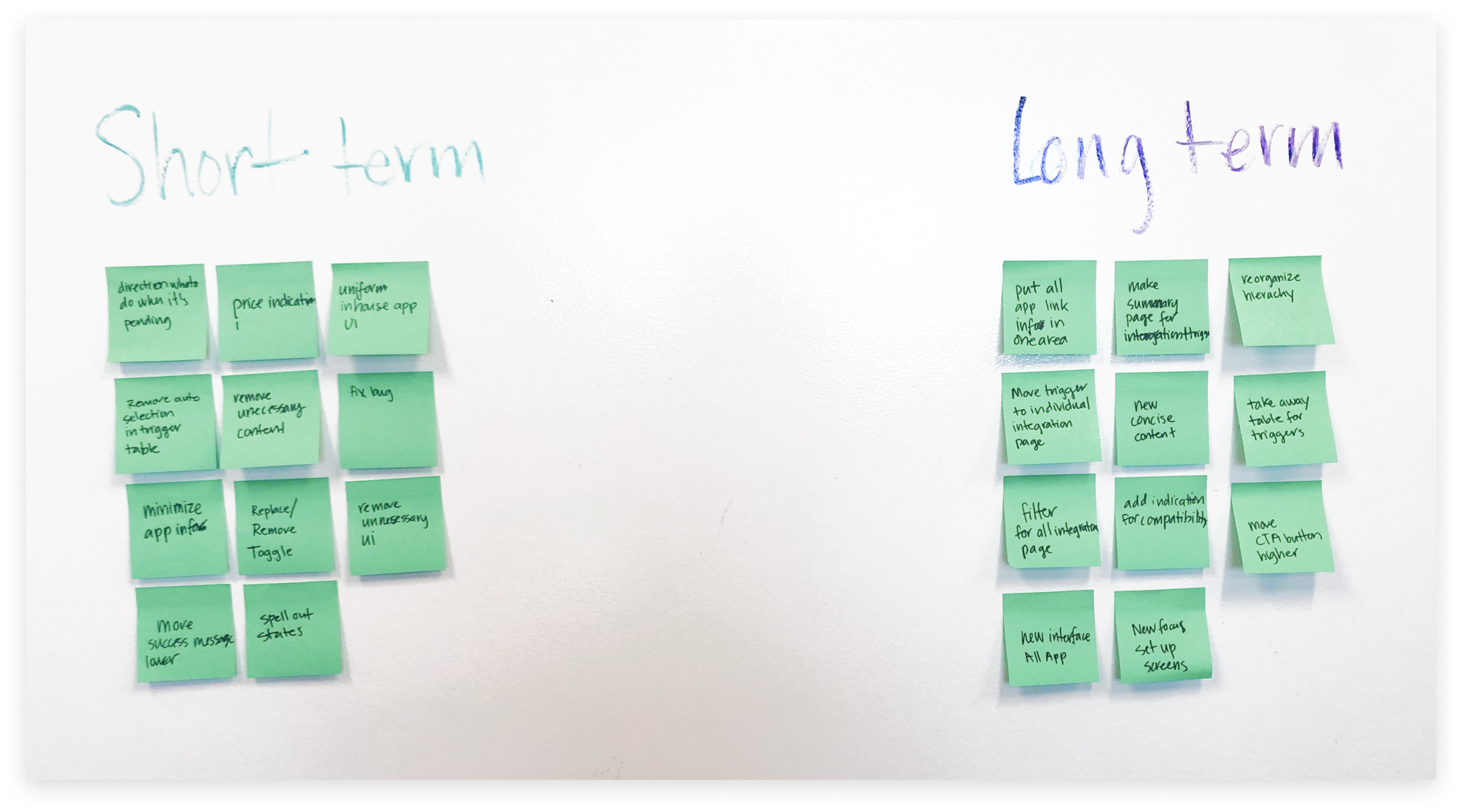
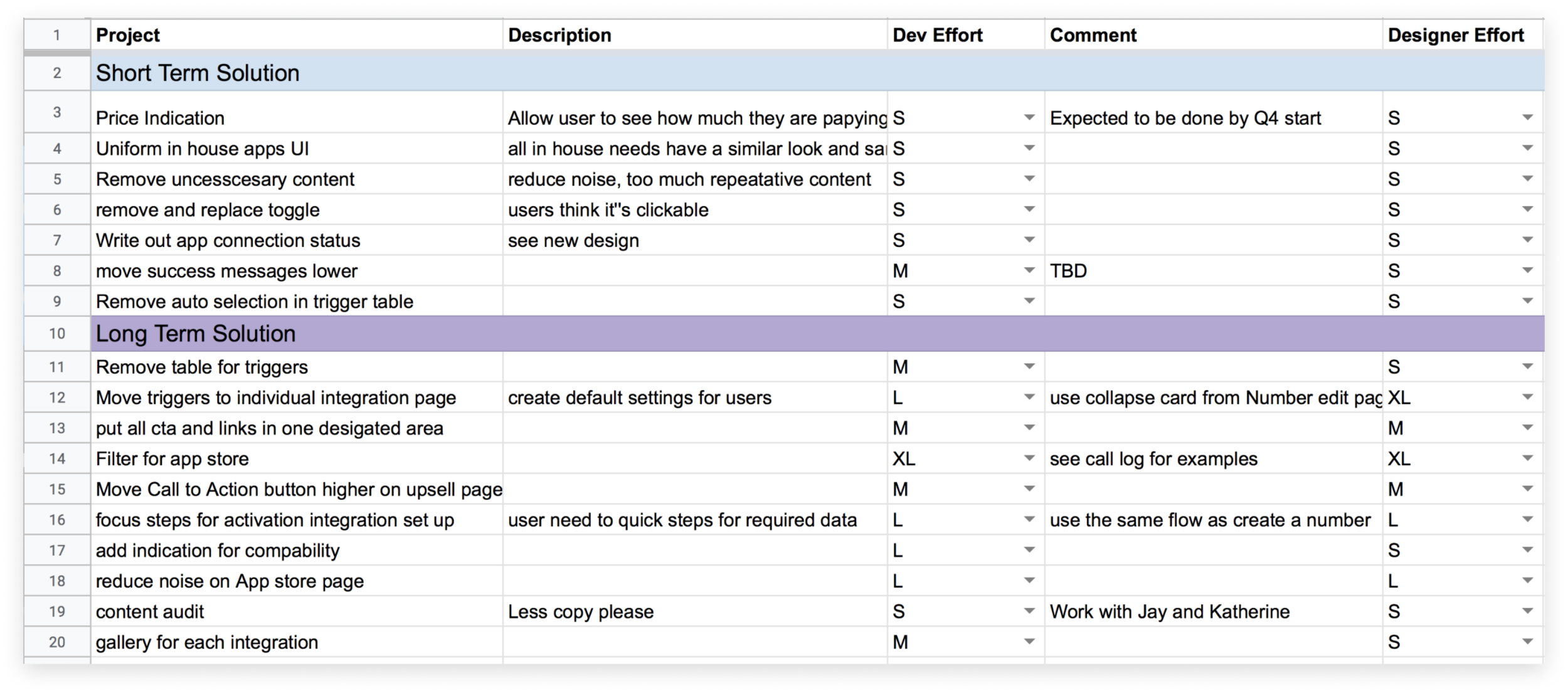
Design Phase 1
Implementing Short-Term Solutions
I replaced the toggle icon with a text pill to indicate connection status
Unnecessary content like "click here" was removed.
Information are grouped together with better padding. This allow user to group different clusters of content at a glance.
I replaced "Select your delay" to "Immediate". This clarified the confusing of the default time if users do not make a selection.
I made calls conversion visible to users. Previously, users have no way of turning it off nor know that CallRail automatically have it turned on.


Design Phase 2 - Long-Term Solutions
Wireframe


High Fidelity
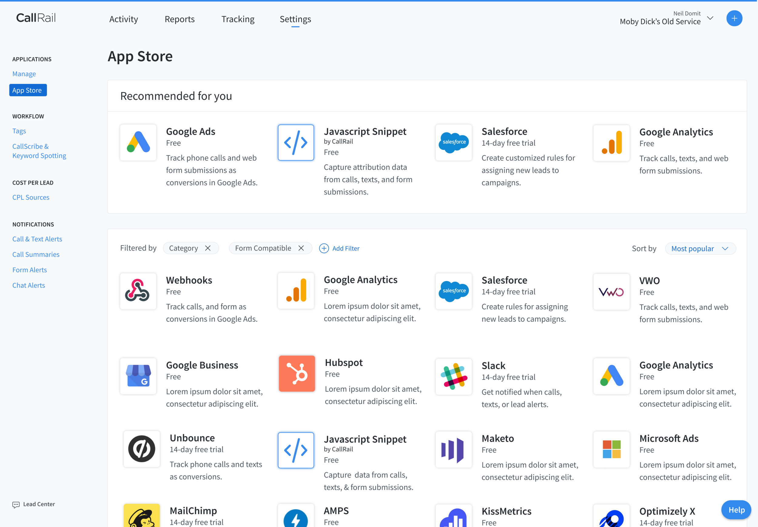
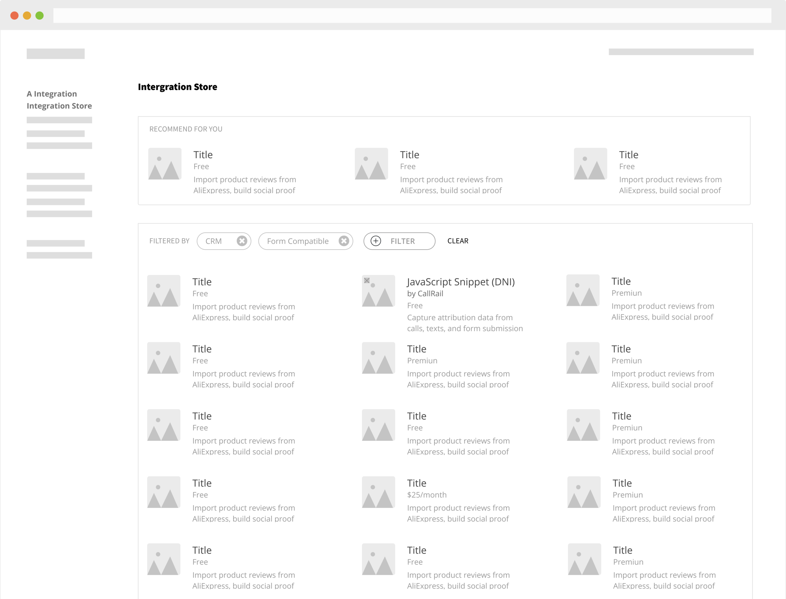
App Store
I increased the pixel to data by removing borders, took away buttons that said the same things,
Google ADs - individual app Upsell Page
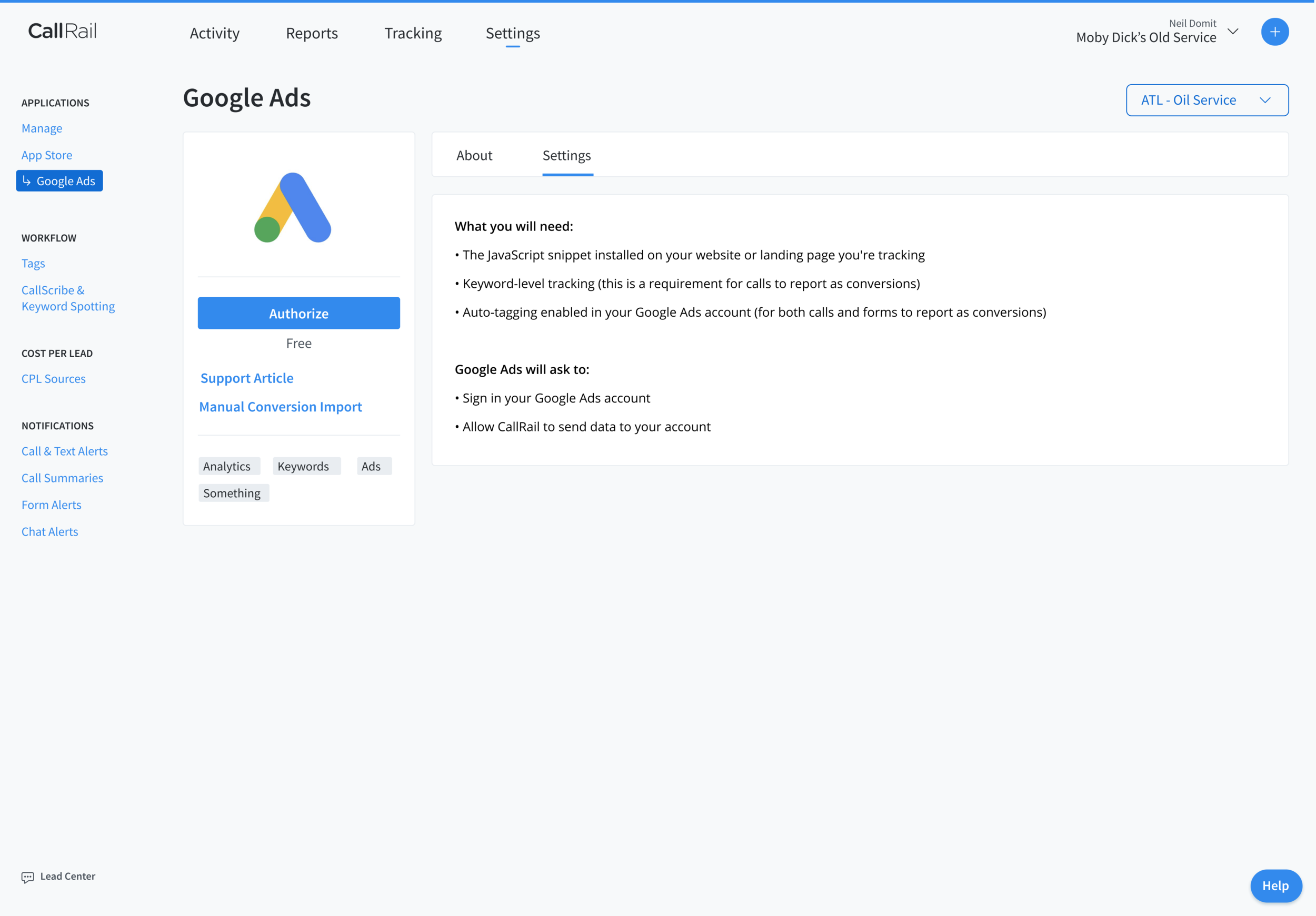
Most users come here activate the app. Not many are here to learn or discover new app. As a result, I moved the CTA up here and increased it visibility. I removed the illustration that does not provide accurate data or meaning.
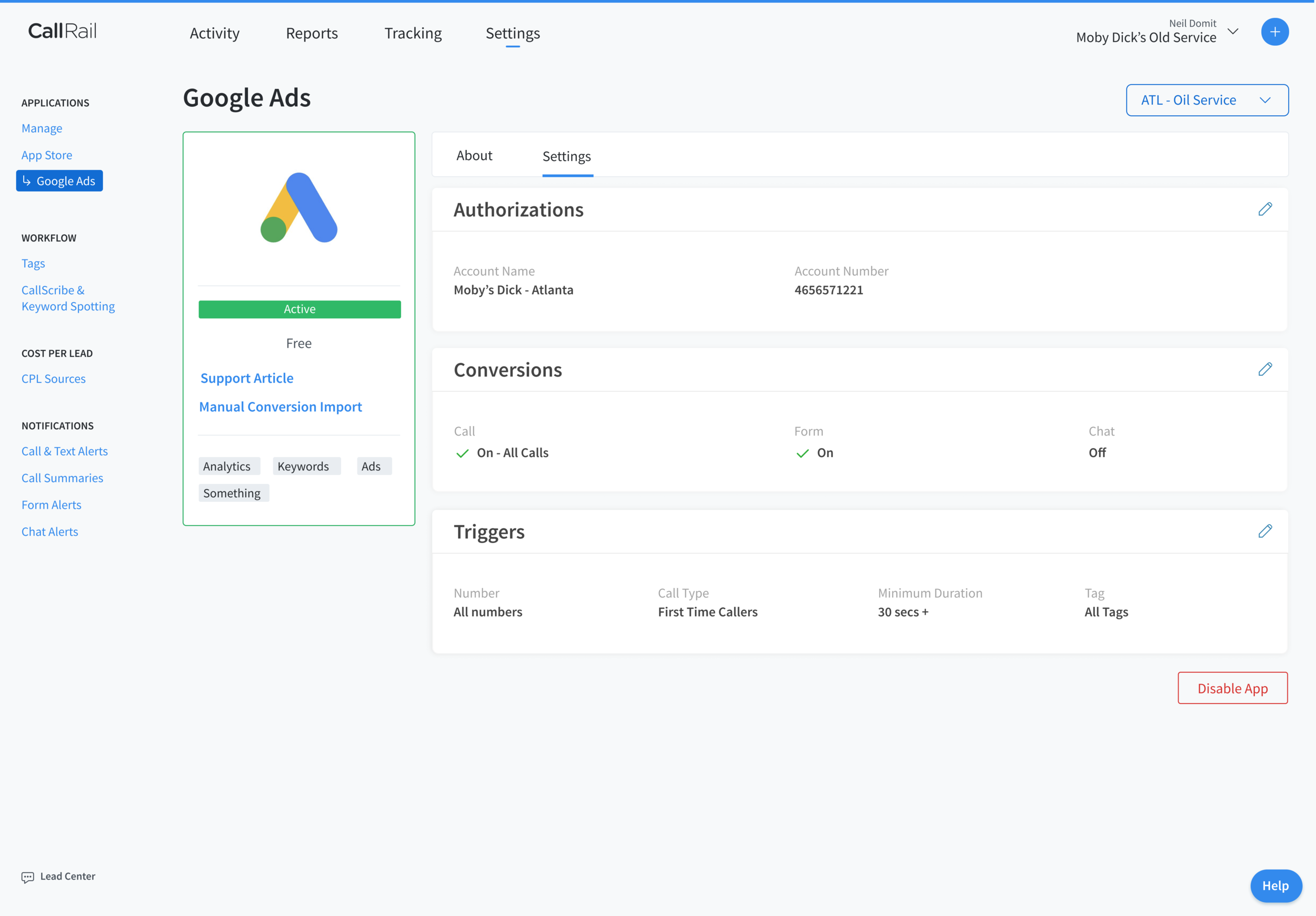
Google ADs - individual app Activated page
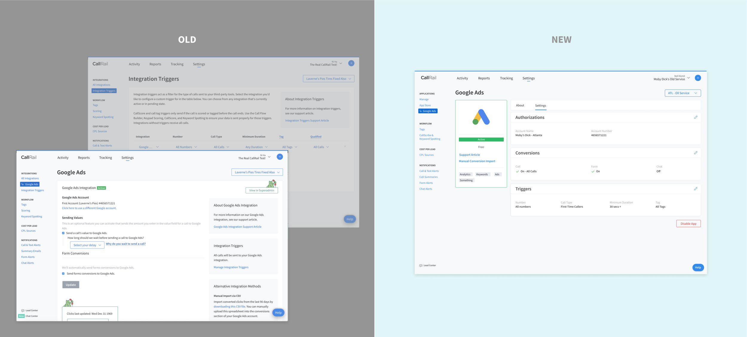
I removed “Integration Triggers” page. Triggers are now managed within the individual app page along with all other settings. We saw a big improvement on in our usability tests.


Usability Testing
To validate our short term and long term designs, we used the same usability test script from our initial test to test our new designs. In our user tests for both short term and long term designs we saw improved task completion.
Results
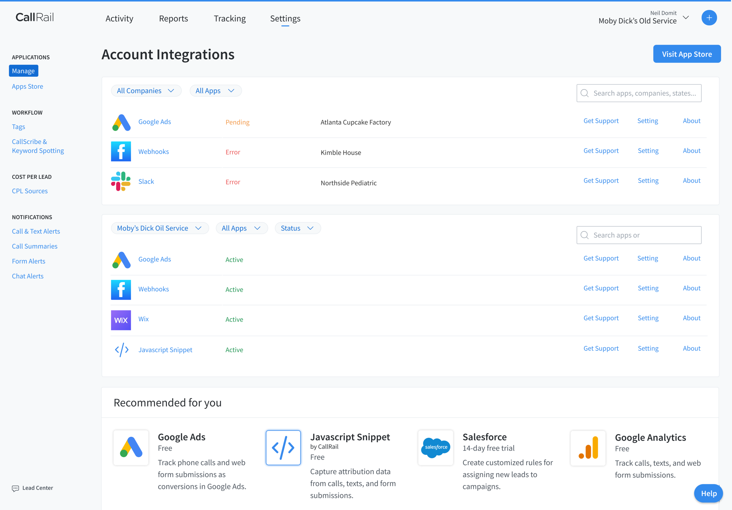
Users found the integration page. However, It took 3 clicks
Click on “Tracking,” “Activity,” then “Settings”
Users were confident turn on Google Ads integration.
James pointed that the “Active” pill is saying “active and it’s green.”
He said, “my account information is visible, which is telling me I’m connected.”
User successfully turned on triggers for Google Ads
User looked for the word “Triggers” and tried to click on the text. Then saw an edit icon.
User took less than 15 minutes to complete all scenarios. This is an improvement. Users took more 30 minutes and did not complete tasks prior to our redesign.
My details analysis can be found here: Integration Usability Test 2 General Takeaways
Results after short-term implementation
After implementing our short term design changes, we saw a 23% reduction in support calls related to the integration page, and a 14% increase in connections.
Current Status
I am working closely with develops and product manager everyday while we are building our long-term solutions. We have divided the design into small tickets. This will make it easier for code review and quick QA.
Plans After Shipping
• Continue to do quality assurance and reporting for bugs.
• Watch users interact with new features on Full Story and monitor Google Analytics.
• Use Zendesk to monitor support tickets relating to the integrations page.
• Visit customers for UX interviews and observation.